Amplify Your Data Using Interactive Graphics
Want to use interactive graphics to help amplify your research? This post talks about how to do that, using my new international research and one other project as examples. Most recently, Science mentioned the interactive table I created (see end of this post).
Two examples of interactive graphics in the news
This post aims to reach both people looking to learn more about (a) interactive graphics and (b) gender bias in science. I discuss two examples here, describe my international study in more depth, and then present the interactive table. A follow-up post will talk about how I made the table.
Example #1: Interactive table [D3.js]
My latest research finds that stereotypes associating science with men prevail worldwide, even in supposedly “gender-equal” nations like Denmark and Norway (PDF; press release). I created an interactive table using the JavaScript library D3.js to show what nations have the strongest stereotypes.
[RELATED POST: 5 Reasons to Learn D3.js]
You might be surprised to learn what nation had the strongest stereotypes out of all 66 nations studied!
I love that the table is so simple (just one interactive control!), yet directly influenced news coverage in Pacific Standard, Science, U.S. News, and Yahoo News. This example demonstrates an important point: simple graphics can sometimes present information more effectively than graphics with many distracting bells and whistles.
In this case, the table helped provide reporters with information about international rankings and statistics. Those reporters did not directly contact me about such details. In fact, only one of those outlets interviewed me on the phone, but we didn’t talk about the detailed rankings that appeared in the final news piece.
So how did the reporters know about my website? Northwestern University’s press release mentioned it. So here’s a tip: if you’ve made awesome graphics for your research, work with your university’s or company’s public relations office to promote it.
Such graphics might also increase the chances that reporters will cover your study. And if reporters do cover your study, those graphics can help provide critical information, as my example demonstrates.
Don’t expect reporters to always directly contact you about your study, especially because the news world can be quite fast paced. Reporters might not have the time to contact you. U.S. News, for instance, covered my study three hours after the press release came out (and yes, the reporter wrote the coverage in just those three hours).
Hence, include critical information about your study in the press release and, if appropriate, provide links to informative interactive graphics. And keep in mind that simple graphics can be quite effective.
Example #2: Interactive graphs [D3.js]
Benjamin Schmidt at Northeastern University made this interactive graphic about gendered language in teacher reviews. The graphic, also created using D3.js, received extensive attention both through social media and major outlets such as New York Times.
Here’s an example screenshot relating to recent research about gender stereotypes that imbue men, not women, with intellectual “genius.”
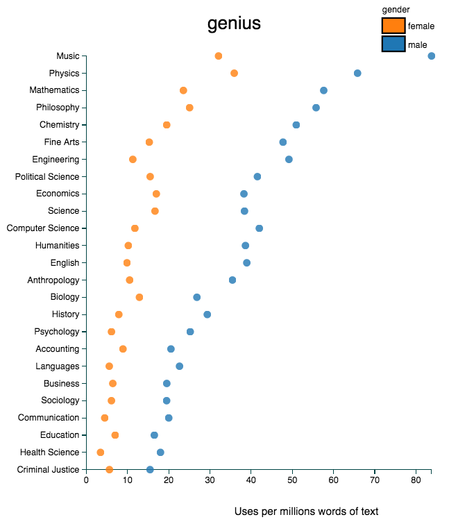
Here’s some example Tweets.
How do student evaluations describe men and women differently? Test your theories here: http://t.co/yLLOcpXZ7u pic.twitter.com/v6OlkjiosU
— Benjamin Schmidt (@benmschmidt) February 6, 2015New charts @girlwpen show #genderbias in teacher reviews http://t.co/i9VljBdUNw Men called "geniuses" Women? “bossy" http://t.co/PiZf0ju9Pt
— deborahsiegel (@girlmeetsvoice) March 10, 2015Just search for "genius" and "brilliant" in this database of student evals of male and female profs | http://t.co/xovednJEzN via @ecsalomon
— Andrei Cimpian (@AndreiCimpian) February 6, 2015chart shows words used to describe male v female professors in online reviews http://t.co/dNwuT9YaNC "fat," "boring" more often used for men
— Catherine Rampell (@crampell) February 8, 2015Also interesting to compare fields. E.g. - word: "caring" - gender dif, yes, but check dif btw edu & econ http://t.co/25Fcl14MAe
— Cedar Riener (@criener) February 6, 2015Huge gender difference for "sweet". I don't like getting that one on evals even though I know the students mean well. http://t.co/E7KQzSelwf
— Beth Visser PhD (@BethAV) February 6, 2015This example demonstrates the power of social media.
In an email to me, Schmidt shared the backstory behind this visualization: it caused a stir on Twitter when he first shared it there, a New York Times reporter contacted him a few hours later, and then other media outlets started to pick up the story.
Major outlets therefore helped highlight the website, but the media attention all started with a well-crafted Tweet.
The study: Gender-science stereotypes prevail worldwide
Here are the details about the study that the interactive table (example #1) accompanies.
- The study: “Women’s Representation in Science Predicts Gender-Science Stereotypes: Evidence From 66 nations,” in press at Journal of Educational Psychology.
- The data: Through a website called Project Implicit, nearly 350,000 individuals in 66 nations completed measures of gender-science stereotypes, making the study the largest ever of its kind. The paper discusses sample characteristics in detail.
- Two measures of stereotypes: Participants both (a) rated how much they associated science with males or females (an “explicit” measure), and (b) completed a computerized task assessing how quickly they associated science words such as “math” and “physics” with male words such as “boy” and “man” (an “implicit” measure).
- The findings: Stereotypes associating science with men prevailed worldwide, even in supposedly “gender-equal” nations like Denmark and Norway. See the table for which nation was #1 (you might be surprised!). Though pervasive, these stereotypes were weaker in nations with more female science majors and researchers.
- Additional information (findings): The main academic contribution of the study is essentially “the more women in science, the weaker stereotypes (with some nuance).” If you’re researcher in social psychology or a related field, you may be very interested in the nuance! So check out the manuscript if you’re enticed by phrases like “associative-propositional model” and “social role theory” (I mean, who wouldn’t be?).
- Additional information (data): And check out the supplemental materials or raw data for you data nerds out there. Expect discussion of sexy things like “mixed-effects meta-regression models” and “unstandardized beta coefficients.” I spent much time gathering data about characteristics of the nations (e.g., measures of gender equity, economic development, prevalence of scientists), so please use my dataset if it’s helpful for an international data project of your own!
The table: Which nations had the strongest stereotypes?
The numbers below for stereotypes can simply be interpreted as standardized national averages. Larger numbers for the first two columns means stronger stereotypes associating science with men. National averages exceeding 0.5 can be considered moderate to large, as explained further in the manuscript (p. 4).